At Paint and Papers, you can shop neutral paint online across leading British brands. That includes Farrow and Ball neutral paint, Little Greene neutral paint, and Paint and Paper Library neutral paint. Each offers a distinct take on neutral paint colours, from warm, grounded shades to cooler, architectural tones.
Shop Paint and Papers Neutral Paint by Brand
A neutral palette changes depending on the brand. Pigment, depth, and finish all affect how a colour reads on the wall.
Farrow & Ball neutral colours tend to feel softer and more traditional. Many shades carry subtle undertones that shift throughout the day. This makes them a strong choice for period homes or spaces where you want a lived-in feel.
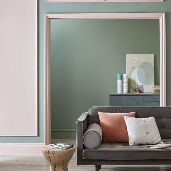
Little Greene neutral colours are often cleaner and slightly more defined. Their range includes both historic tones and sharper modern neutrals, making them well-suited to neutral living spaces in contemporary interiors.
Paint & Paper Library’s neutral colours focus on depth and richness. Their palette includes strong greige paint colours, stone paint colour options, and darker neutrals that hold their own in larger spaces.
If you are comparing brands, look at how each handles undertones. A beige paint in one brand may read pink, while another feels more yellow or grey. That difference matters once it is on your walls.
Cream and Beige Paint Colours
Cream paint colours and beige paint are often grouped, but they behave differently in a room.
Cream paint colours sit closer to soft white paint colours. They reflect more light and help brighten darker rooms. Shades like ivory wall paint or linen paint colour work well in spaces that need lift without going stark.
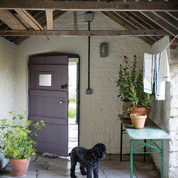
Beige paint sits deeper. It carries more pigment and brings warmth. This makes it a reliable choice for neutral paint for living room schemes where you want a grounded, comfortable feel.
You will also see crossover shades:
- Greige paint colours, which balance grey and beige
- Mushroom paint colour, which leans slightly earthy
- Sand paint colour and oatmeal paint colour, which feel soft and relaxed
These sit in the middle of the neutral paint colour chart. They work well if you want flexibility without committing to a strong warm or cool direction.
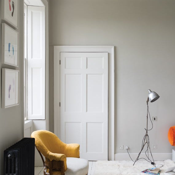
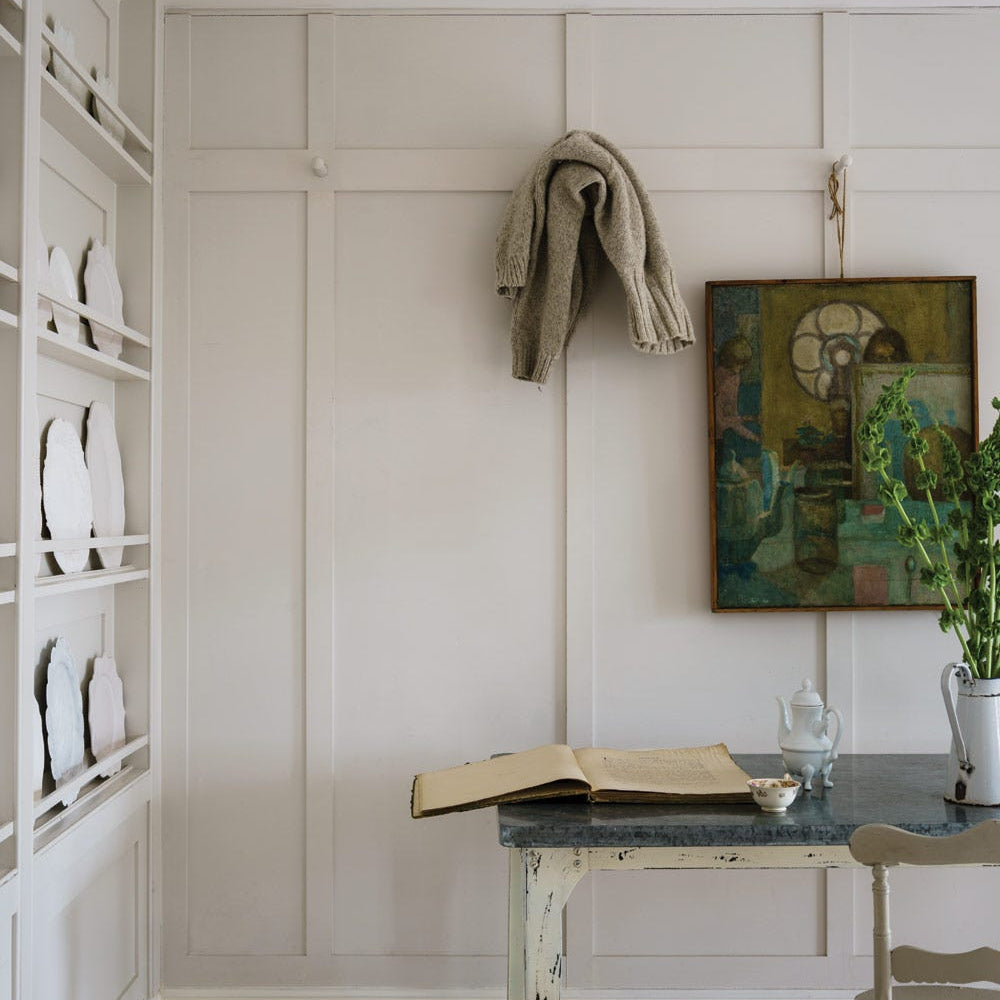
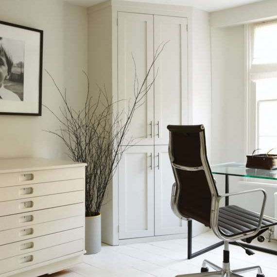
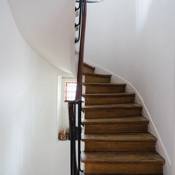
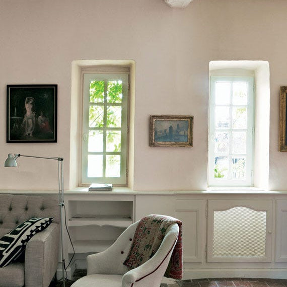
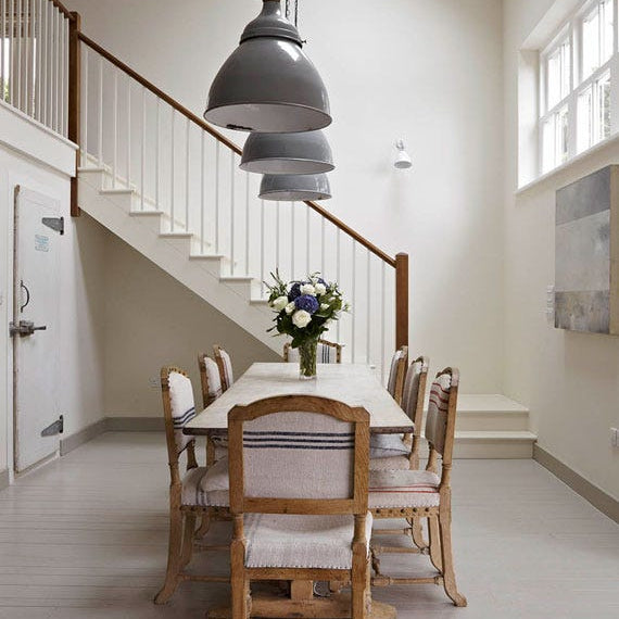
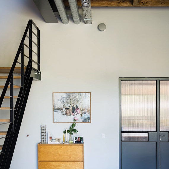
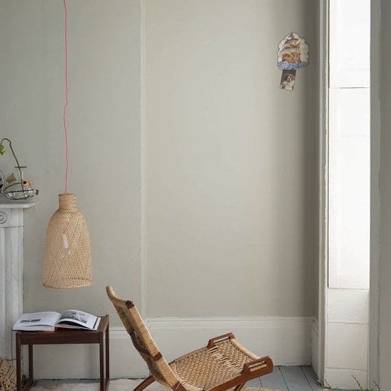
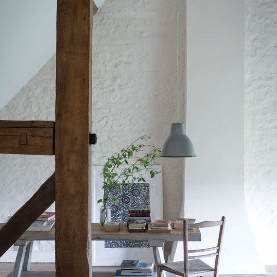
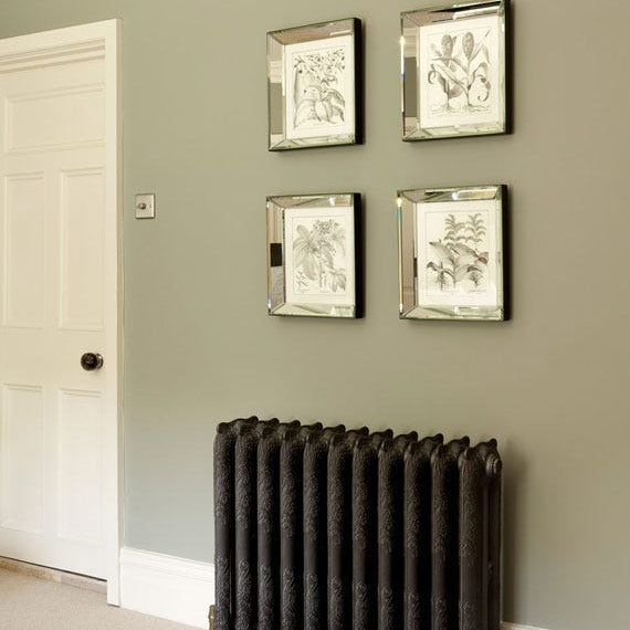
Neutral Paint for Living Rooms and Hallways
Neutral paint for living room spaces needs to do more than look good in isolation. It has to work with furniture, flooring, and changing the light.
For living rooms:
- Warm neutral paint colours create a more relaxed, inviting feel
- Cooler tones suit neutral paint for modern interiors and minimalist decor
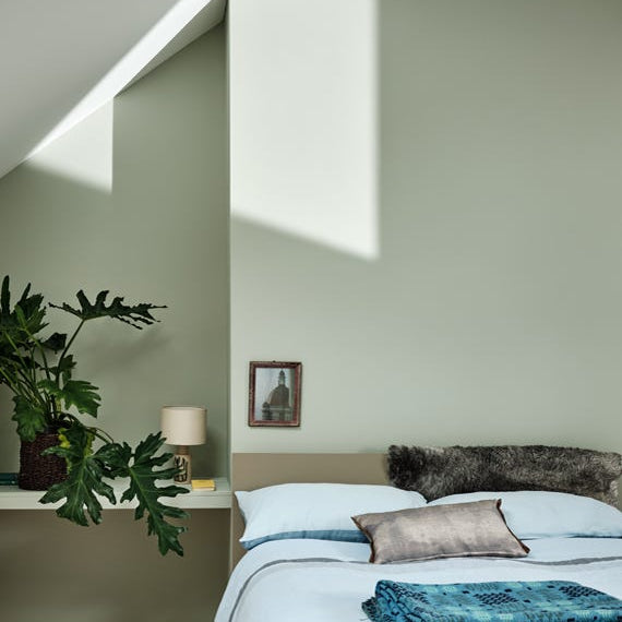
- Mid-depth neutrals, such as taupe wall paint, help anchor larger spaces
For hallways:
- Use lighter neutral paint colours to keep the space open
- Off-white paint or soft white paint colours reflect light well in narrow areas
- Durable, washable neutral paint is important for high-traffic areas
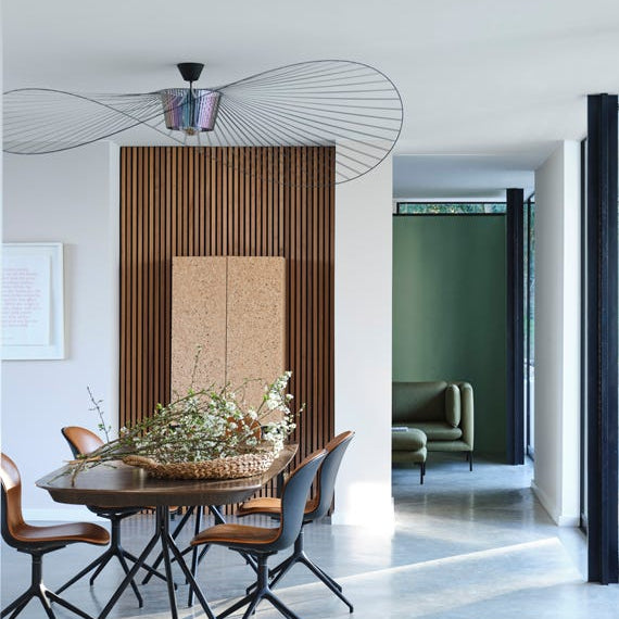
If you are working with an open plan layout, choose a neutral paint for open plan living that connects each zone. A consistent base colour with subtle variation across finishes can help define areas without breaking the flow.
Also consider direction:
- Neutral paint for north-facing rooms often benefits from warmer undertones
- Neutral paint for south-facing rooms can handle cooler, crisper shades
How to Choose a Neutral Paint Colour
Neutral paint looks simple. In practice, small shifts in undertones make a big difference.
Start with light:
- Check how much natural light your room gets
- Look at how it changes from morning to evening
Then check undertones:
- Neutral paint undertones can lean pink, yellow, green, or grey
- Compare against flooring, tiles, and worktops
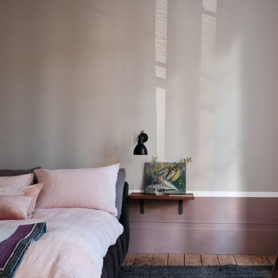
Next, consider use:
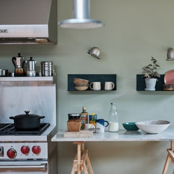
- Neutral paint for kitchen areas should be durable and easy to clean
- Neutral paint for bedroom spaces can sit softer and more muted
- Neutral paint for hallway areas needs to handle wear
Also, think about scale:
- Lighter tones suit neutral paint for small rooms
- Deeper neutrals work well in neutral paint for large rooms
Finish matters too:
- Neutral paint finish in matt gives a flat, modern look
- Neutral paint finish in eggshell adds slight durability for walls and woodwork
- Neutral paint finish in satin is better for trim and high-use areas
Finally, check the practical side:
- Low VOC neutral paint supports better indoor air quality
- Choose washable neutral paint where needed
A neutral paint colour chart helps you compare options, but nothing replaces testing in your own space.
Order a Sample Pot Today
The safest way to choose Paint and Papers’ neutral paint is to test it properly.
Order a neutral paint sample pot and apply it to more than one wall. Look at it:
- In natural daylight
- Under artificial light
- Next to flooring and fabrics
Hold paint swatches and paint neutral samples directly onto the wall rather than relying on printed cards alone. This gives you a more accurate read of depth and undertones.
When you order neutral paint online in the UK, sampling first avoids costly mistakes. It also gives you confidence in your final choice.
FAQs
What are the best neutral paint colours?
The best neutral paint colours are those that suit your room’s light and existing finishes. Warm neutrals such as beige paint, cream paint colours, and taupe wall paint create a more comfortable feel. Cool neutral paint colours like greige paint colours look cleaner and more modern. Test neutral paint sample pot options on multiple walls and check them at different times of day.
What is the most popular neutral wall colour?
Off-white paint and soft white paint colours remain the most popular neutral wall colour choices. They work across both traditional homes and modern interiors. Greige paint colours are also widely used because they balance warmth and coolness. Popular shades tend to sit mid-range on a neutral paint colour chart with subtle undertones.
How do I choose a neutral paint colour for my room?
Start by assessing your room’s light and direction. Neutral paint for north-facing rooms often needs warmth, while neutral paint for south-facing rooms can handle cooler tones. Match undertones to fixed elements such as flooring and joinery. Use paint swatches, neutral samples and sample pots to test colours before committing.
Choosing the right Paint and Papers neutral paint comes down to understanding how colour behaves in your space. With the right testing and a clear view of undertones, you can create neutral living spaces paint schemes that feel considered, balanced, and easy to live with.