
The Colour Edit | Paint and Papers Blog
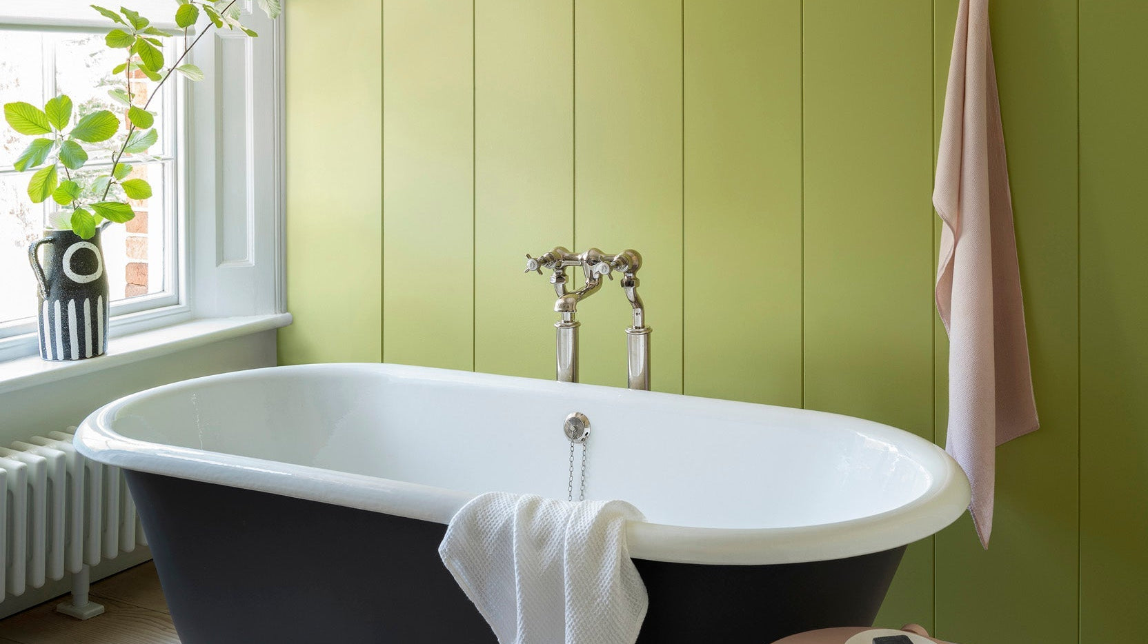
What's Actually in Your Paint Tin
Today is World Environment Day - a good moment to talk about what actually goes into the paint on your walls. The brands we stock have been leading on sustainability...
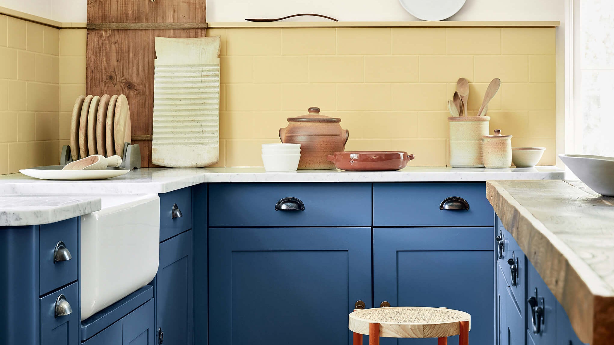
The Colour That Works Everywhere (Yes, Even There)
There's a persistent myth that blue rooms feel chilly, and we're here to dismantle it. You've got a room. You know the one. The one you keep painting white because...
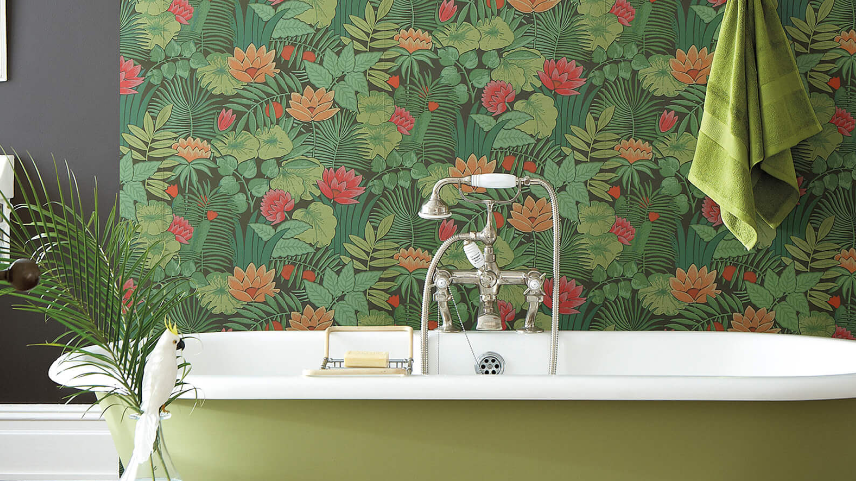
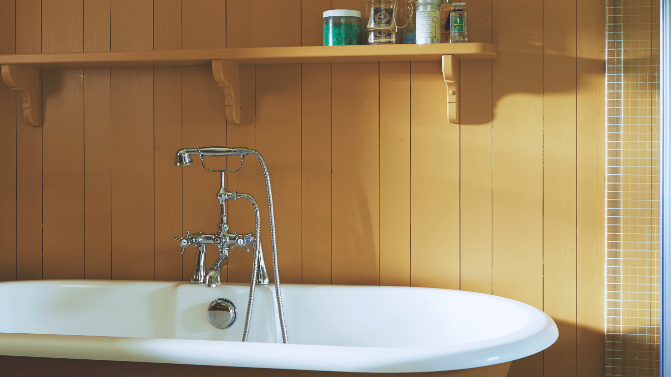
The Spring Bathroom Edit
Spring is the perfect moment to rethink the bathroom. Often treated as purely practical, it’s actually one of the best places to experiment with colour. A bright, sun-filled palette can...
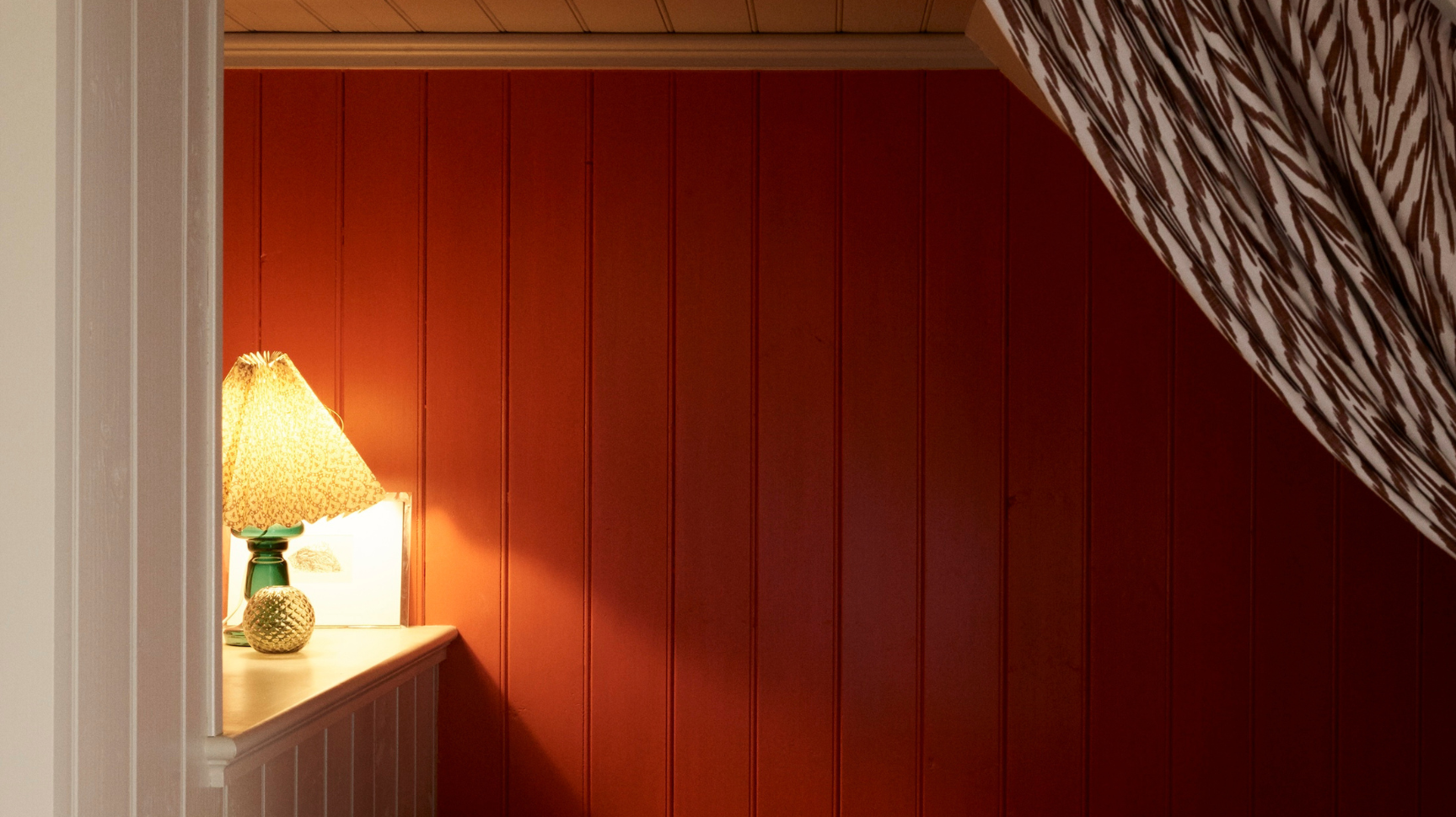
It's Not You, It's Your Bedroom
Sleep Well Starts With Your Sanctuary March is National Sleep Awareness Month - and yes, while counting sheep is charming, your bedroom environment actually plays a huge role in...
3 Colours To Inspire Your Spring Interiors
Spring is on its way. This is the season of reset: an opportunity to rethink colour, to combine tones in more considered, unexpected ways. Inspired by the mood and lightness...

Why This Colour Looks Different at Home
Light changes everything when it comes to paint. The same shade can feel bright and airy in one room, and deeper or warmer in another - simply depending on the...

The New Neutral: Rediscovering Pink
Valentine’s Day is a moment to celebrate warmer, more expressive tones - soft blushes, terracottas, and rich reds that bring depth and comfort to an interior. These shades continue to...

Why Winter Is the Best Time to Paint
Winter light is lower and cooler, which means undertones are clearer and colours behave more truthfully. Shades that rely on bright daylight can feel flat or wrong, while well-balanced colours...

The One Question You Should Ask Before Choosing a Paint Colour
Most people start by asking what colour looks nice.The better question is: how do I want to feel in this room - and when do I spend the most time...

Why Colour Drenching Works (And When It Doesn’t)
Colour drenching removes visual breaks. By using one colour across walls, ceilings and woodwork, the eye stops jumping between surfaces and the room feels calmer and more considered. When the...

Can White Be a Colour of the Year?
Pantone has spoken - and for 2026, the Colour of the Year is Cloud Dancer. A soft, airy white designed to bring calm, clarity and a sense of reset. A...
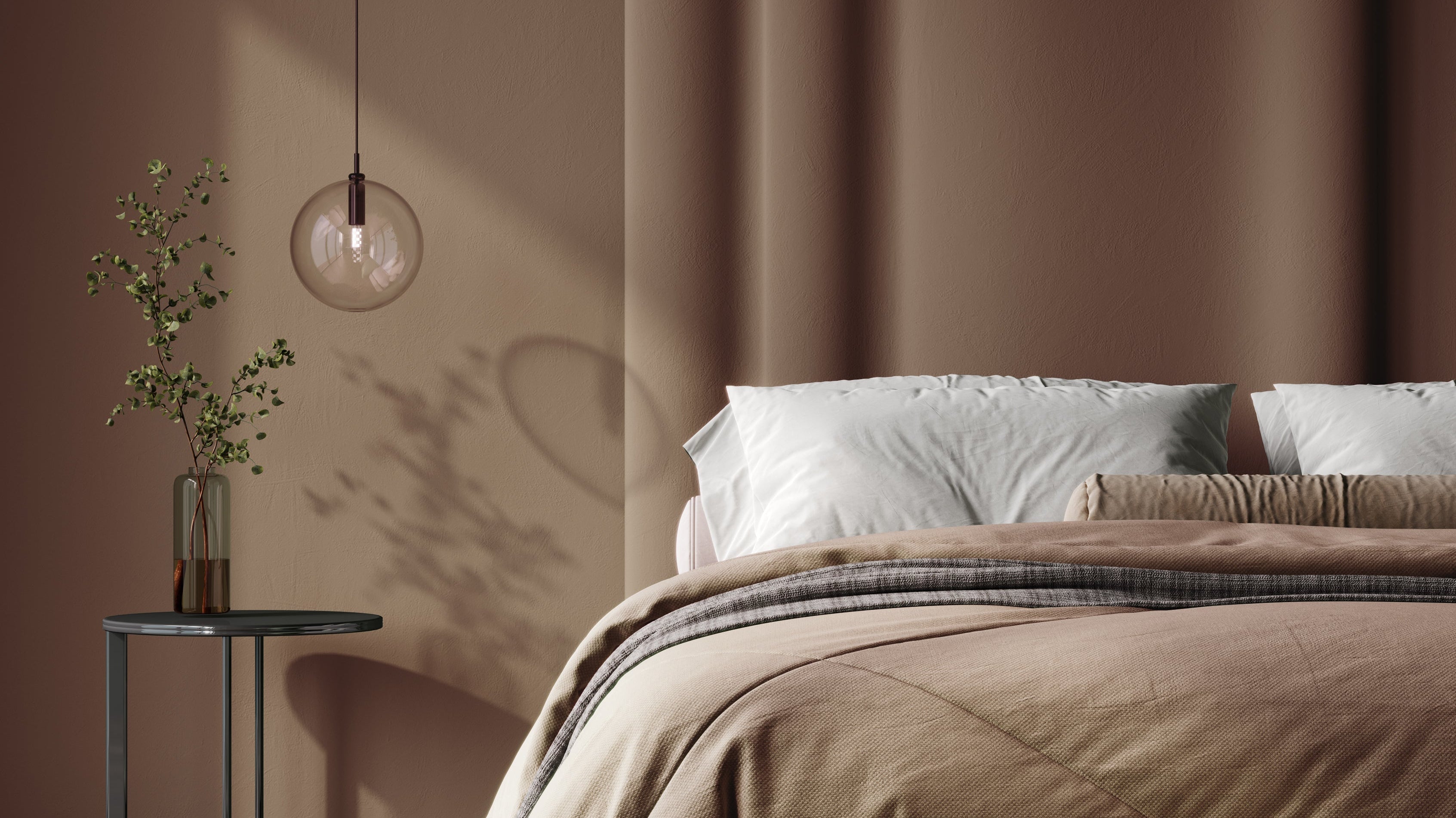
Why most bedroom colours feel wrong at night
Most bedroom colours are chosen in daylight — and that’s where the problem starts. Natural light is clear and balanced, so colours appear fresh and true. But in the...

