
Room orientation plays a major role when choosing paint colours for your home. Natural light (and the direction it enters) can dramatically change how a shade appears on the wall throughout the day. Considering each room’s light conditions individually will help you choose a colour that truly suits the space.
South-Facing Rooms (Warm, Bright Light)
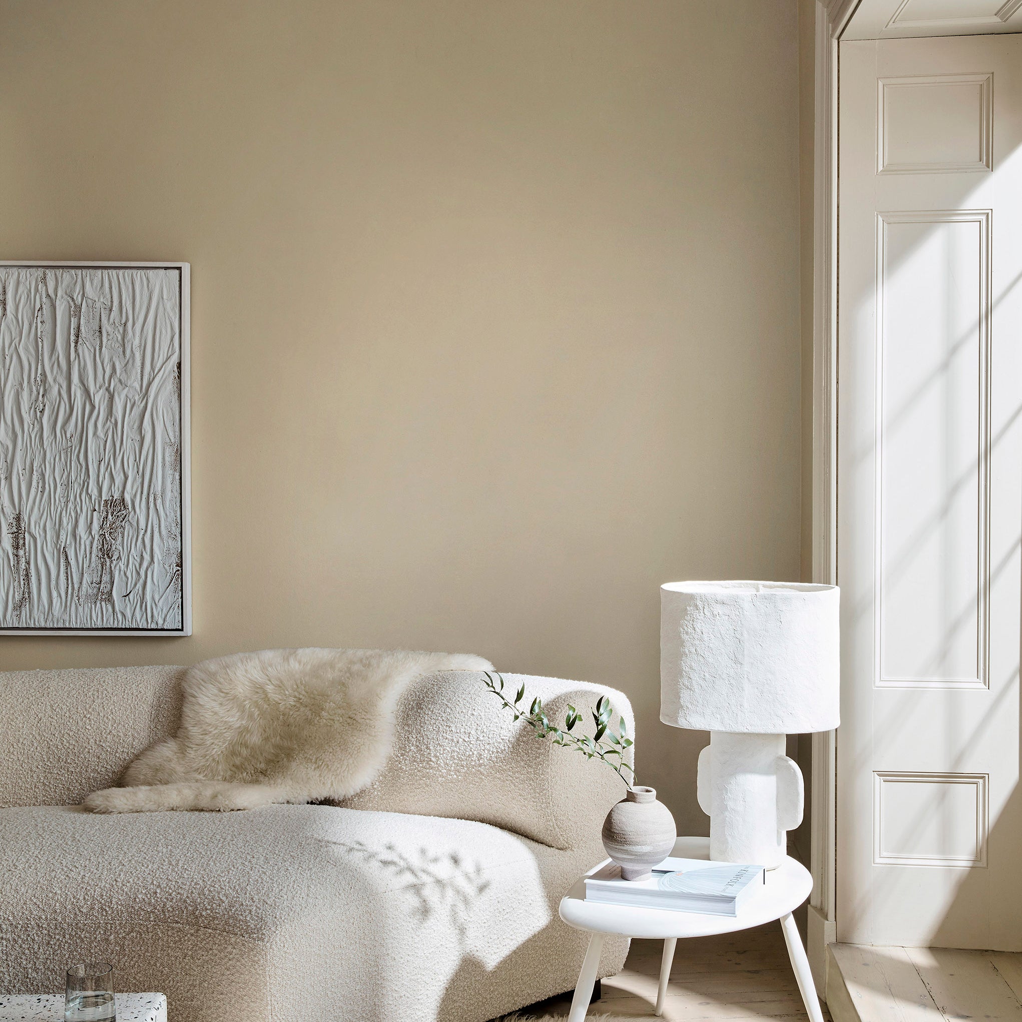
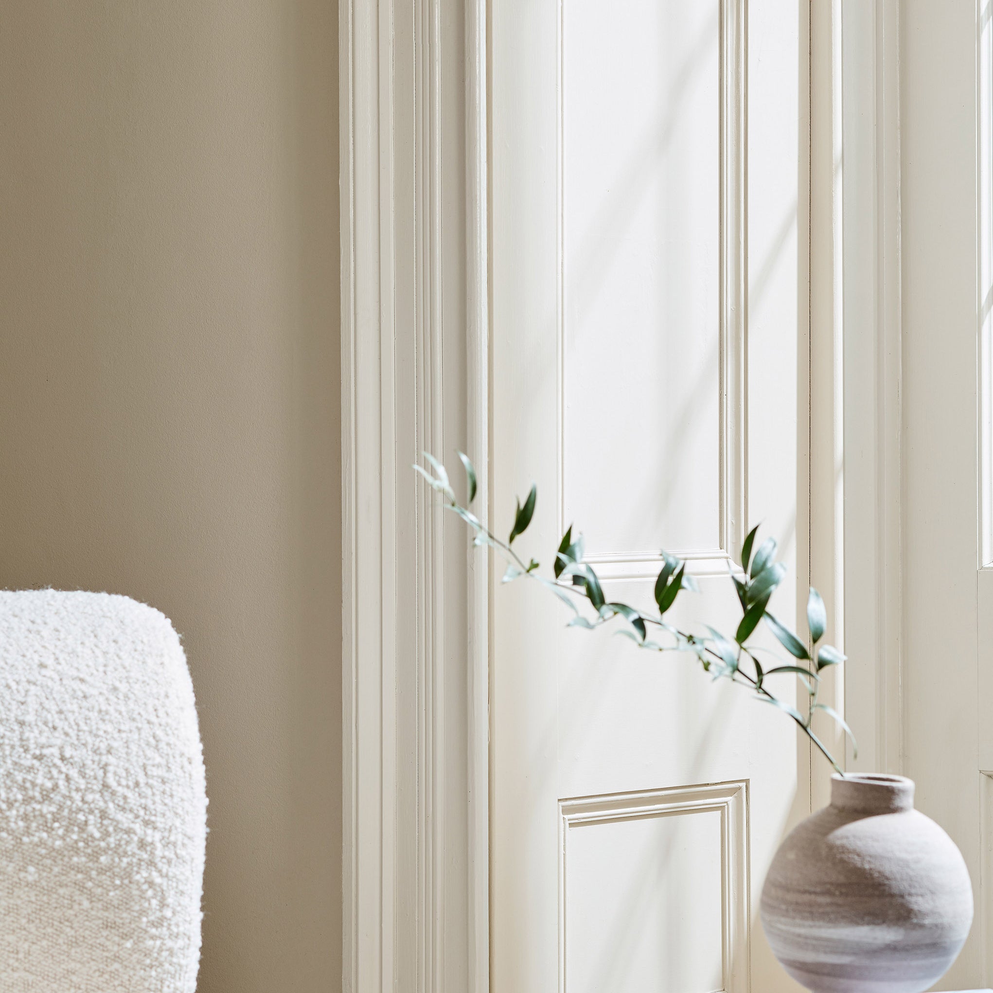
South-facing rooms are filled with warm natural light for most of the day, which makes them some of the easiest spaces to decorate. That said, the brightness can also be quite intense, and it often causes colours (especially neutrals) to appear warmer or more golden than expected.
What you’ll notice:
- Whites can appear creamier or more yellow
- Warm neutrals can look richer than expected
- Colours often feel brighter and more vibrant
What works: Cooler tones help offset the warmth beautifully. Soft whites such as Gauze or French Grey - Pale by Little Greene tend to read clean and fresh, while gentle blues like Borrowed Light or Pavilion Blue by Farrow & Ball create an airy, calming feel.
Warm whites, on the other hand, like Joa’s White by Farrow & Ball as well as Silent White or First Light by Little Greene will appear more cream in tone.
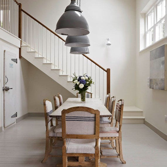
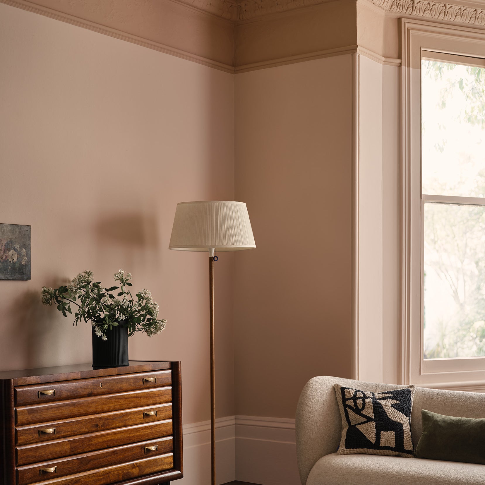
If you’d like to embrace the sunlight, south-facing rooms are also a perfect setting for colour. Rich, confident yellows such as Yellow-Pink by Little Greene or Giallo by Paint & Paper Library glow in this light, bringing an uplifting, joyful energy to the space.
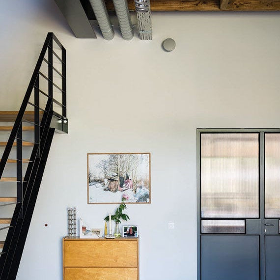
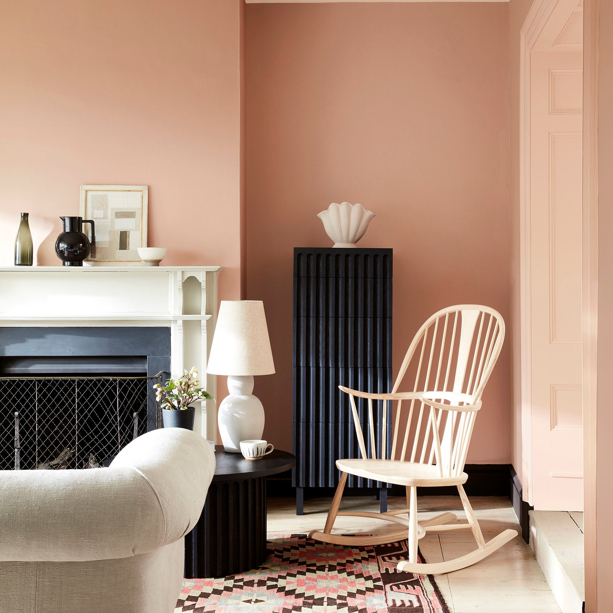
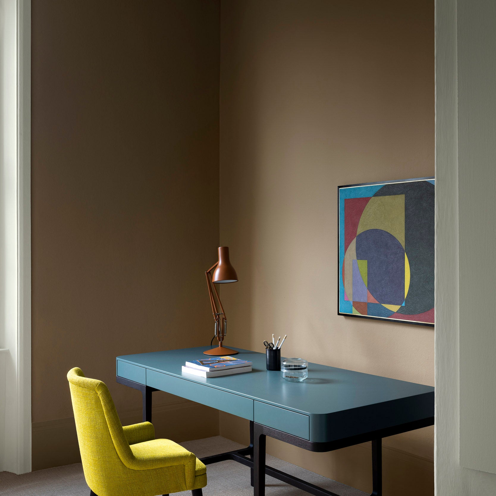
South light also lifts deeper shades, allowing bold colours to feel dramatic without becoming heavy. Consider dark blues like Royal Navy by Little Greene, Hicks’ Blue by Farrow & Ball, Kigali or Mockingbird by Paint & Paper Library as timeless alternatives to charcoal or black. They create a luxurious, cocooning atmosphere while still feeling vibrant in the daylight.


North-Facing Rooms (Cool, Muted Light)
North-facing rooms receive very little direct sunlight, which means they tend to feel cooler and more shaded throughout the day. In these spaces, colours often appear softer, flatter, and slightly greyer than they would in brighter rooms, and artificial lighting plays a much bigger role in how the paint is perceived.
What you’ll notice:
- Colours can appear flatter or slightly greyer
- Blue and grey undertones become more pronounced
- Bright whites can look stark
What works: Add warmth. Choose colours with soft undertones of yellow, tan, pink or red to bring balance. If space allows, adding a mirror can help reflect light and make the space feel brighter.
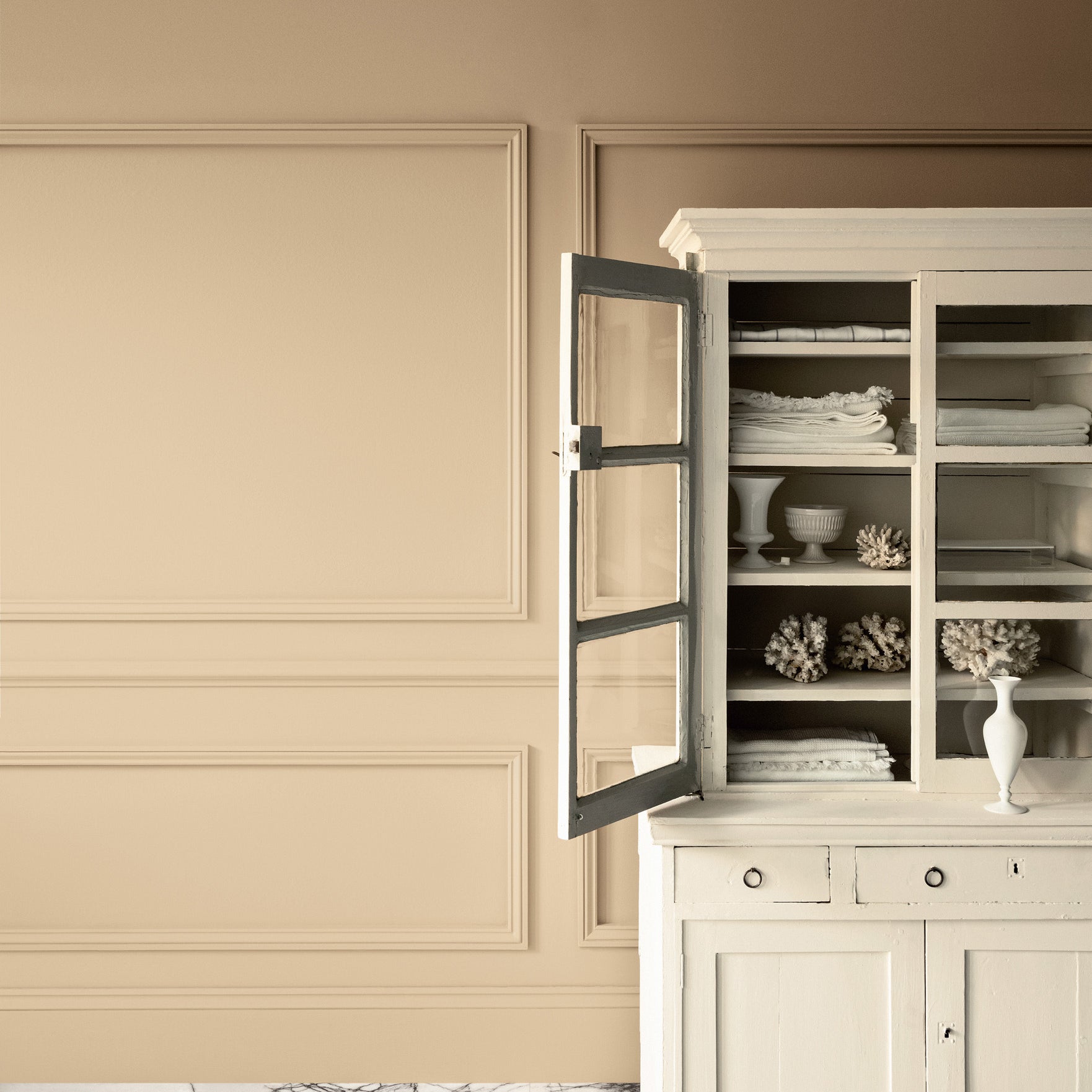
Warm neutrals like Masquerade and Clay by Little Greene or Paint & Paper Library's Sand family create an inviting backdrop, and gentle off-whites such as Farrow & Ball's New White or White Tie help reflect light around the space. Shades with gentle yellow, pink, tan or brown undertones help counteract the blue-toned light and create a more welcoming atmosphere.
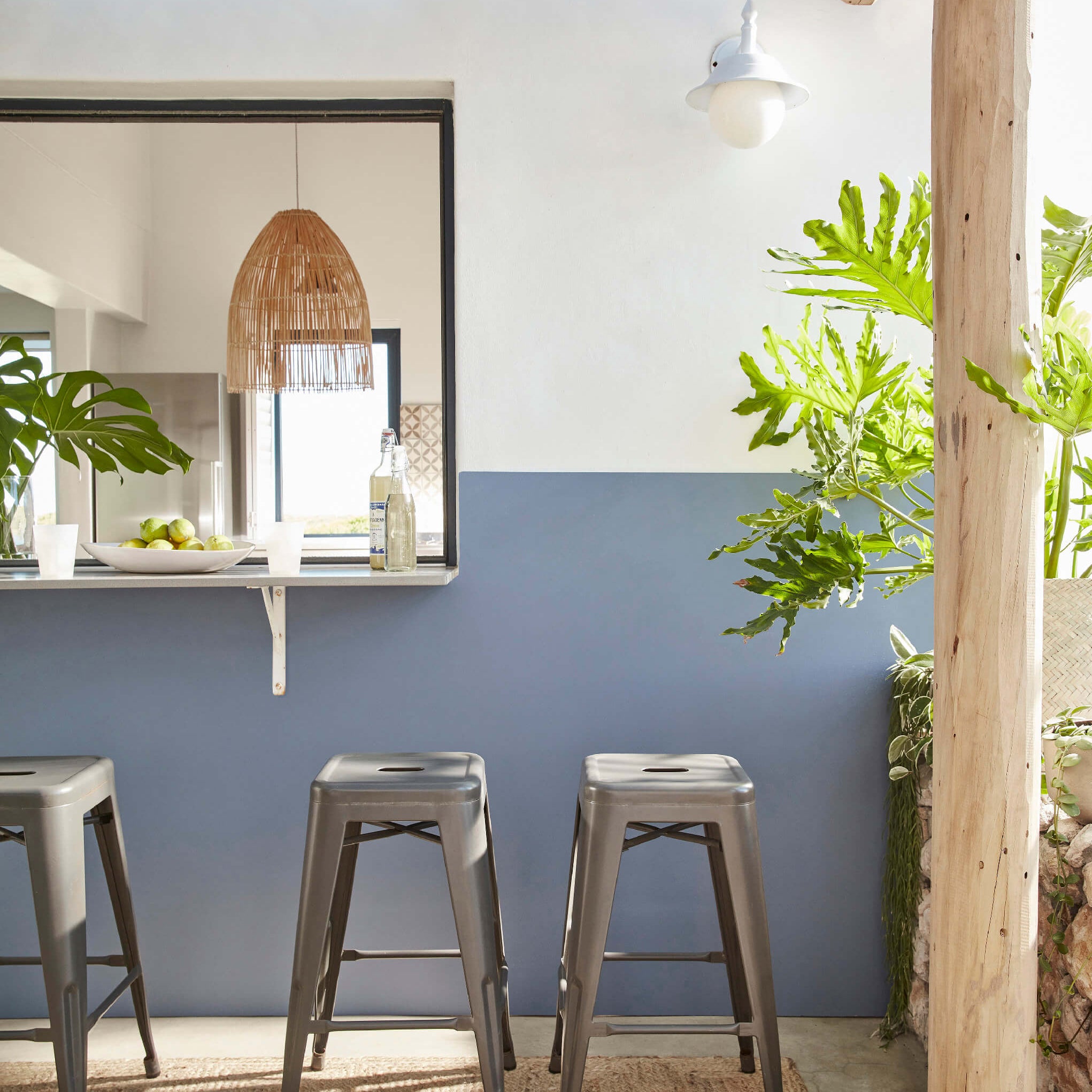
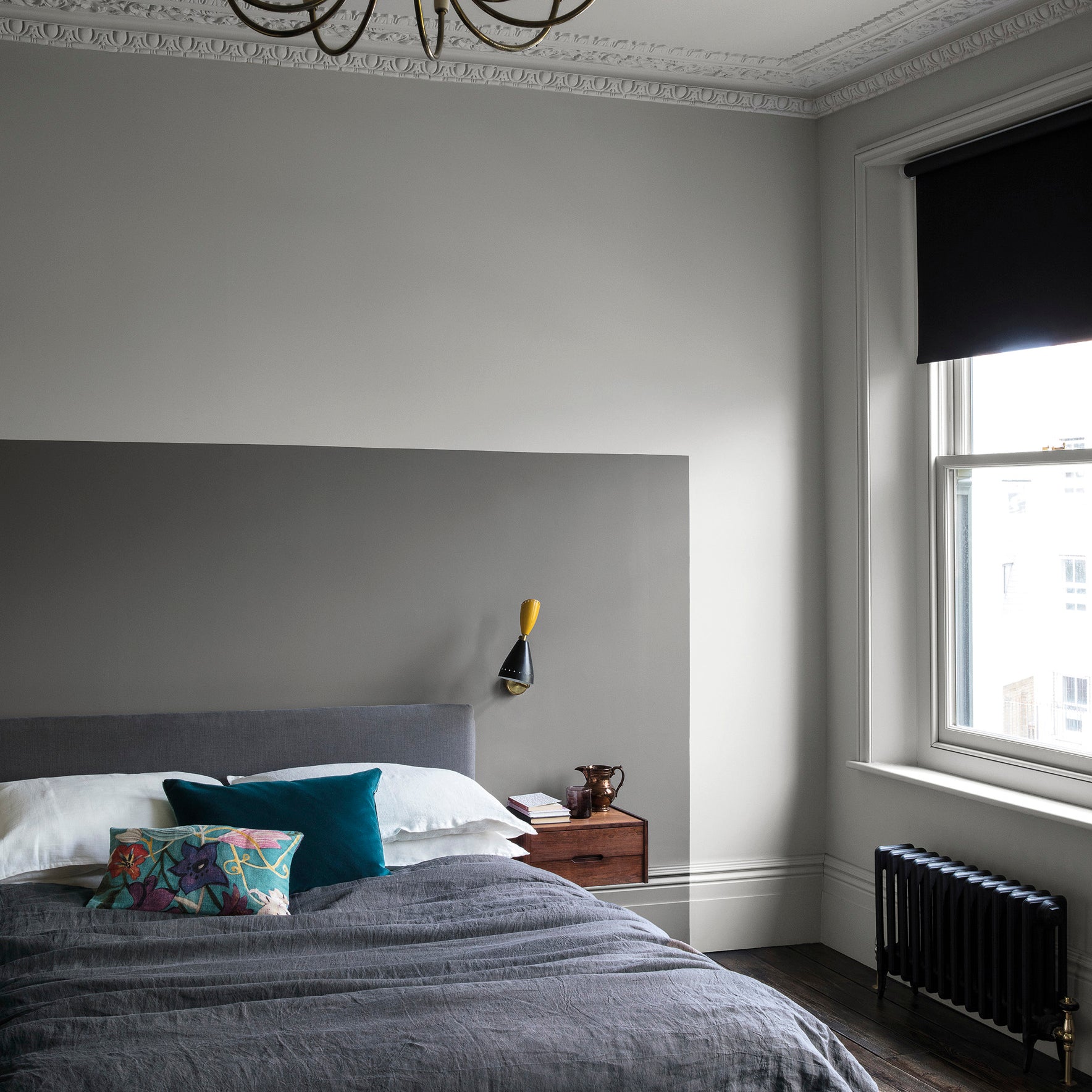
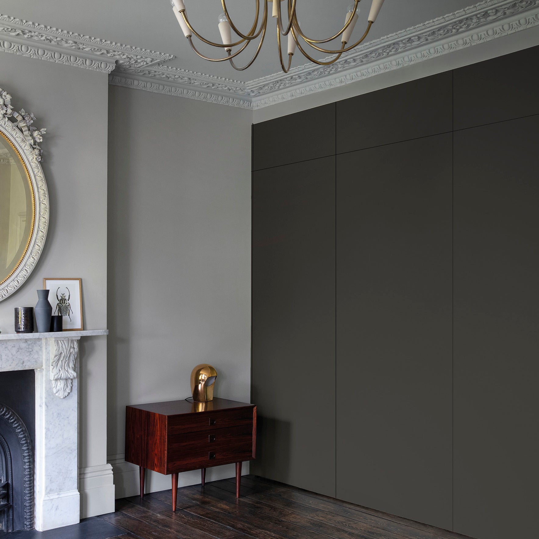
If you want to use blues or greens in a north-facing room, opt for stronger, more saturated shades like Little Greene's Air Force Blue Deep Water Green by Paint & Paper Library, which hold their character better in cooler light.
And if you prefer to lean into the natural mood of a north-facing space, deeper tones like Railings or Down Pipe by Farrow & Ball can create a beautifully cocooning, intimate feel - perfect for bedrooms, snug rooms, or evening spaces.


East-Facing Rooms (Bright Mornings, Cooler Evenings)
East-facing rooms are filled with warm morning sunshine, but the light becomes cooler and softer later in the day. These spaces are wonderful for kitchens and bedrooms. The key is considering when you use the room most.
What you’ll notice:
- Colours feel radiant early on
- Tones become more muted by afternoon
- Blue and green undertones become more noticeable in evening light
What works: If you mainly use the room in the morning, make the most of that beautiful early sun with warm, radiant colours. If the room is used more in the evening, consider leaning into the cooler light.
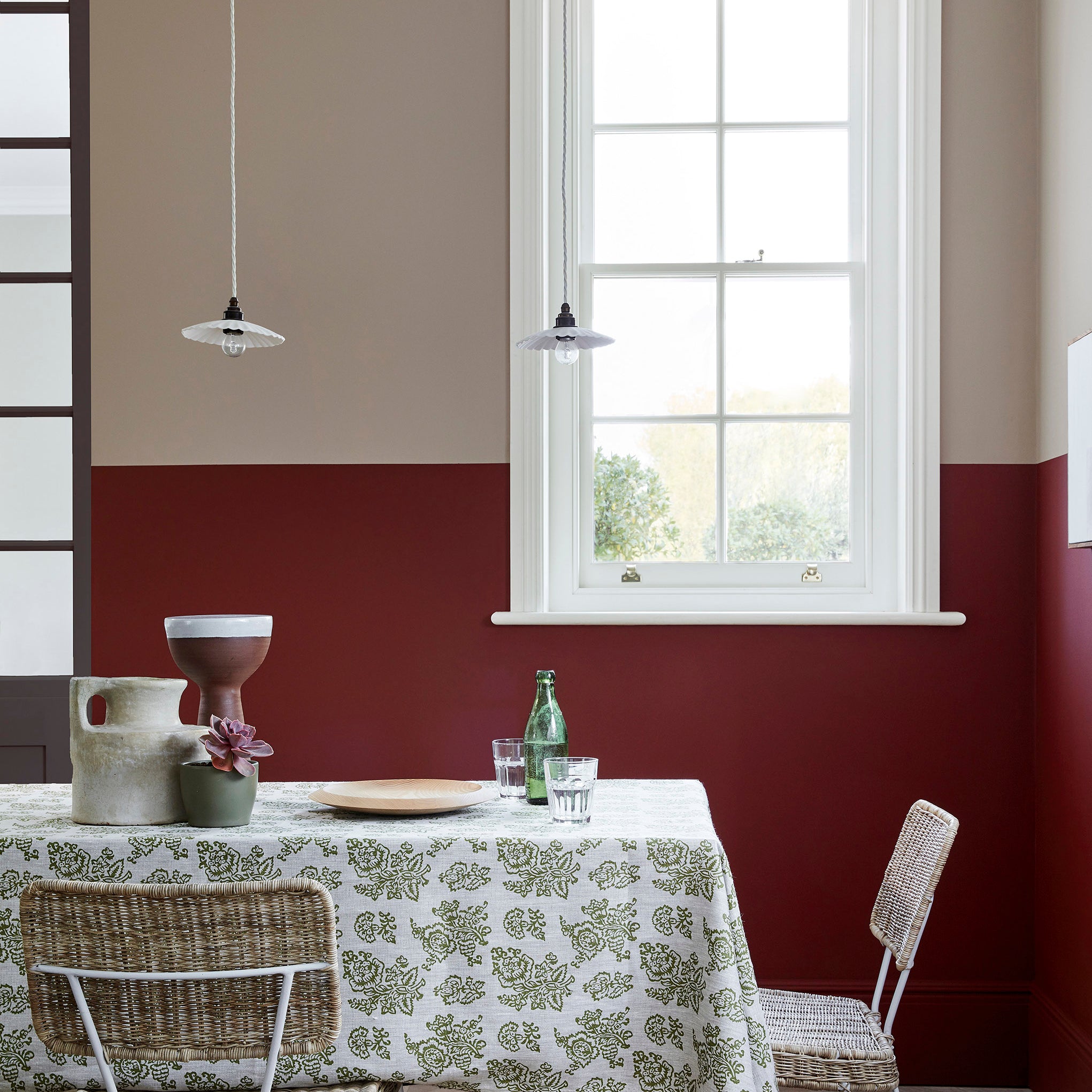
Soft yellows and fresh greens enhance the natural glow and keep the space feeling energised. Shades like Morning Room or Brimstone by Paint & Paper Library amplify the dawn light, while lively greens such as Farrow & Ball's Breakfast Room Green bring a fresh, optimistic feel.
Gentle blues and soft greens create a calm, relaxed atmosphere - colours like Boringdon Green, Windmill Lane by Little Greene or Farrow & Ball's Teresa’s Green feel beautifully balanced as the light softens. For a more cocooning effect, deeper tones such as Goblin (Little Greene) or Farrow & Ball's Inchyra Blue or Hopper Head add richness and depth without feeling harsh.
For a neutral scheme, choose colours with subtle yellow or red undertones to maintain warmth throughout the day. Hues from Paint & Paper's Architectural Collection like Leather, Cashmere or Paper families create harmony in east-facing spaces, appearing bright and fresh in the morning and comfortably soft by evening.
East-facing rooms are wonderfully versatile - they can feel bright and energising at breakfast, then calm and restful by dusk. Choosing the right undertone ensures the space works beautifully from sunrise to sunset.


West-Facing Rooms (Cool Mornings, Golden Afternoons)
West-facing rooms experience cooler light in the morning, followed by strong, golden sunlight in the late afternoon and evening. This dramatic shift makes them some of the most dynamic spaces in a home and the time of day you use the room most should guide your colour choice.
What you’ll notice:
- Morning light feels cooler and slightly muted
- Afternoon light becomes warm and golden
- Colours appear richer and more intense later in the day
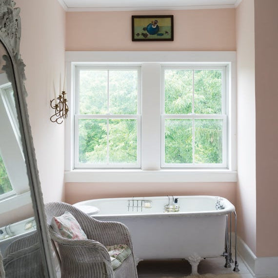
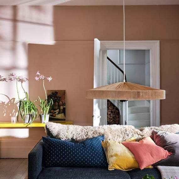
What works: If you use the room mostly in the afternoon or evening, embrace the warm glow. Soft pinks and warm neutrals such as Little Greene's Masquerade or Farrow & Ball's Setting Plaster come alive in golden light, creating a welcoming, flattering atmosphere. Similarly, versatile neutrals like Farrow & Ball's Slipper Satin or Shaded White balance both the cooler morning tones and the warmth later on.
West-facing light pairs beautifully with blue-greens. Shades like Paint & Paper Library Iguana or Blue Gum feel vibrant yet harmonious against the yellow warmth of late sun. If you prefer something more adaptable, colours such as Farrow & Ball's Light Blue or subtly shift between blue and silver throughout the day.
For a timeless foundation, consider architectural neutrals. Paint & Paper Library’s Architectural Palette is designed specifically for layering, allowing you to build depth through tonal variation. Shades from the Stone and Slate families respond beautifully to shifting light, working effortlessly in calm, muted schemes or as a balanced backdrop to bolder accent colours.
West-facing rooms are ideal for layering tone. Using varying strengths from the same colour family - walls, woodwork, architectural details - creates depth that evolves beautifully from morning coolness to evening warmth.


The Best Way to Choose Confidently: Sample Properly
Light is what brings colour to life - and sampling is the only way to see how it will truly behave in your space.
How to Test Paint Colour Properly:
- Paint large areas directly onto the wall to see how the colour truly behaves in the space.
- If you can’t paint the wall, use lining paper - its soft off-white base gives a more accurate result than bright white and avoids interference from the existing wall colour.
- Avoid painting small patches side by side; colours influence each other and distort how they’re perceived.
- Place samples in different areas of the room to observe how they look in varying light throughout the day.
Don’t Forget Artificial Light
Most rooms are experienced just as much in the evening as they are in daylight, so it’s important to consider your bulbs too. Warm bulbs will make colours feel richer and creamier, cool white bulbs can give paint a bluer cast, while neutral bulbs offer the most accurate balance. That's why it is important to always check your sample both in daylight and under lamps before committing.
